7 分钟
python的可视化包–Matplotlib
一、初级
1、安装
Windows安装
pip install matplotlibLinux安装
- Debian / Ubuntu : sudo apt-get install python-matplotlib
- Fedora / Redhat : sudo yum install python-matplotlib
2、Pyplot教程
(1)介绍
matplotlib.pyplot是使matplotlib像MATLAB一样工作的命令样式函数的集合。每个pyplot函数对图形进行一些更改:例如创建一个数字,在图中创建一个绘图区域,在绘图区域绘制一些线条,用标签装饰图形等等。在matplotlib.pyplot中,函数调用中保留各种状态,以便跟踪当前图形和绘图区域等内容,并且绘图功能针对当前轴。
import matplotlib.pyplot as plt
plt.plot([1,2,3,4])
plt.ylabel('some numbers')
plt.show()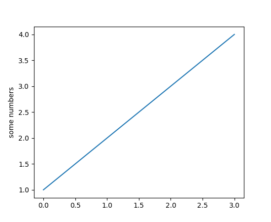 你可能想问为什么x轴的范围是0-3,y轴的范围是1-4。如果你只提供了一个list给
plot()命令,matplotlib假定它是一个y值序列,并为您自动生成x值。由于python范围从0开始,默认x向量的长度与y的长度相同,而是以0开始。因此x数据为[0,1,2,3]。
plot()是一个通用的命令,并且会占用任意数量的参数。例如,要绘制x对y,可以发出命令:
plt.plot([1, 2, 3, 4], [1, 4, 9, 16])对于每一个x,y对的参数,有一个可选的第三个参数,它是格式字符串,表示绘图的颜色和线型。格式字符串的字母和符号来自MATLAB,并且将颜色字符串与线型字符串连接起来。默认的格式字符串是“b-”,它是一条实线的蓝线。例如,要用红色圆圈绘制上面的内容:
import matplotlib.pyplot as plt
plt.plot([1,2,3,4], [1,4,9,16], 'ro')
plt.axis([0, 6, 0, 20])
plt.show()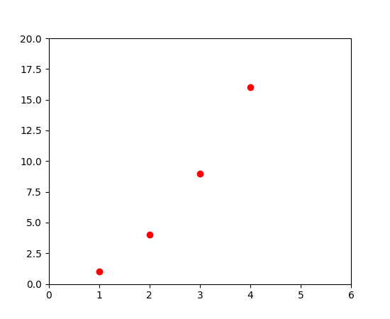
格式字符串说明:
线型
================ ===============================
character description
================ ===============================
'-' solid line style
'--' dashed line style
'-.' dash-dot line style
':' dotted line style
'.' point marker
',' pixel marker
'o' circle marker
'v' triangle_down marker
'^' triangle_up marker
'<' triangle_left marker
'>' triangle_right marker
'1' tri_down marker
'2' tri_up marker
'3' tri_left marker
'4' triright marker
's' square marker
'p' pentagon marker
'*' star marker
'h' hexagon1 marker
'H' hexagon2 marker
'+' plus marker
'x' x marker
'D' diamond marker
'd' thin_diamond marker
'|' vline marker
``’‘`` hline marker
================ ===============================
颜色 ========== ======== character color ========== ======== ‘b’ blue ‘g’ green ‘r’ red ‘c’ cyan ’m’ magenta ‘y’ yellow ‘k’ black ‘w’ white ========== ========
上述示例中的axis()命令采用[xmin,xmax,ymin,ymax]的列表,并指定轴的可视范围。
如果matplotlib被限制在使用列表,数字处理将是相当无用的。 一般来说,你将使用numpy数组。 如果说matplotlib只能使用列表,那么它对数组的处理将是一无是处的。一般来说,matplotlib的使用者将会使用numpy数组。事实上,所有的序列都在内部转换为numpy数组。
下面的例子说明了使用数组在一个命令中绘制不同格式样式的几条线。
import numpy as np
import matplotlib.pyplot as plt

# evenly sampled time at 200ms intervals
t = np.arange(0., 5., 0.2)

# red dashes, blue squares and green triangles
plt.plot(t, t, 'r--', t, t**2, 'bs', t, t**3, 'g^')
plt.show()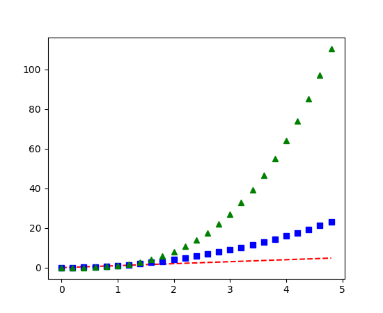
(2)控制线的属性
线有很多属性可以设置:线宽,破折号风格,抗锯齿等;见matplotlib.lines.Line2D。有几种方法来设置线条属性:
使用关键字参数:
plt.plot(x, y, linewidth=2.0)使用Line2D实例的setter方法。
line, = plt.plot(x, y, '-')
line.set_antialiased(False) # turn off antialising
使用
setp()命令lines = plt.plot(x1, y1, x2, y2) # use keyword args plt.setp(lines, color='r', linewidth=2.0) # or MATLAB style string value pairs plt.setp(lines, 'color', 'r', 'linewidth', 2.0)
点击查看Line2D属性
要获取可设置的行属性列表,请以Line2D对象作为唯一参数调用setp()函数
In [69]: lines = plt.plot([1, 2, 3])

In [70]: plt.setp(lines)
  alpha: float
  animated: [True | False]
  antialiased or aa: [True | False]
  ...snip
(3)在多个图形和轴下工作
名词/命令解析
figure()表示创建或切换一个图形(表现为一个窗口)subplot()表示在当前图形中创建或切换子图axes()表示将当前图形当前子图的轴(参考系例如(0,0)点)移到当先坐标系的某个点上plot()一个绘图命令,在当前图形的当前坐标系的当前轴内绘制图形
MATLAB和pyplot具有当前图形和当前轴的概念。所有绘图命令适用于当前轴。函数gca()返回当前轴(一个matplotlib.axes.Axes实例),gcf()返回当前图形(matplotlib.figure.Figure实例)。通常情况下,您不必了解,因为它们都在后台自动进行。以下是创建两个子图的脚本。
import numpy as np
import matplotlib.pyplot as plt

def f(t):
    return np.exp(-t) * np.cos(2*np.pi*t)

t1 = np.arange(0.0, 5.0, 0.1)
t2 = np.arange(0.0, 5.0, 0.02)

plt.figure(1) #创建一个图
plt.subplot(211) #创建一个子图并指定其坐标范围
plt.plot(t1, f(t1), 'bo', t2, f(t2), 'k')

plt.subplot(212)
plt.plot(t2, np.cos(2*np.pi*t2), 'r--')
plt.show()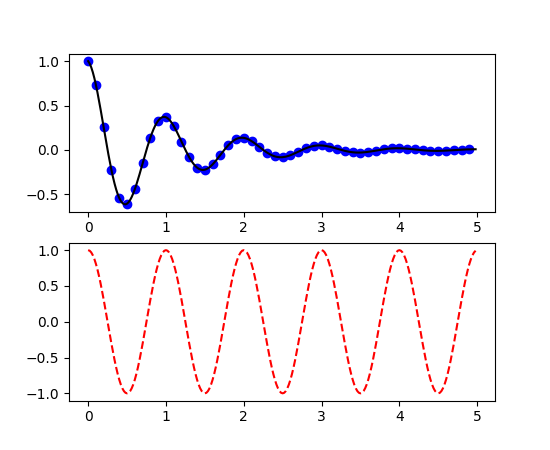
这儿的figure() 命令是可选的,因为figure(1)将默认创建,只要不手动指定任何轴,默认将创建subplot(111)。subplot()命令指定numrows,numcols,fignum,其中fignum的范围从1到numrows*numcols。如果numrows*numcols<10,则逗号。所以subplot(211)等价于subplot(2, 1, 1)。您可以创建任意数量的子图和轴。如果要手动指定轴,例如:不使用矩形方格,就要使用 axes()命令,他可以指定轴的位置像axes([left, bottom, width, height])其中所有值都以小数(0到1)坐标。更多请看:手动放置轴axes_demo.py和多子图的例子subplots_demo.py
你可以创建多个图形(多个窗口)通过使用调用figure(num)。当然每个图形都可以根据需求包含多个轴和子图:
import matplotlib.pyplot as plt
plt.figure(1)                # 第一个图形
plt.subplot(211)             # 第一个图形的第一个子图
plt.plot([1, 2, 3])
plt.subplot(212)             # 第一个图形的第二个子图
plt.plot([4, 5, 6])


plt.figure(2)                # 第二个图形
plt.plot([4, 5, 6])          # 默认创建subplot(111)子图

plt.figure(1)                # 切换到figure(1)的最后一个创建的subplot(212)
plt.subplot(211)             # 切换到figure(1)的subplot(211)
plt.title('Easy as 1, 2, 3') # 给 211 添加标题
You can clear the current figure with clf() and the current axes with cla().
使用clf()可以删除当前图形,使用cla()可以清楚当前轴
如果您正在制作大量图形,则需要注意以下事项:图形所需的内存不会完全释放,直到图形被close()显式关闭为止。删除对图形的所有引用,和/或使用窗口管理器来杀死图形出现在屏幕上的窗口是不够的,因为在调用close()之前,pyplot维护内部引用。
(4)使用文字
text()命令可以在任意位置添加文本,xlabel(), ylabel() 和 title()可以在制定位置添加文本
import numpy as np
import matplotlib.pyplot as plt

# Fixing random state for reproducibility
np.random.seed(19680801)

mu, sigma = 100, 15
x = mu + sigma * np.random.randn(10000)

# the histogram of the data
n, bins, patches = plt.hist(x, 50, normed=1, facecolor='g', alpha=0.75)


plt.xlabel('Smarts')
plt.ylabel('Probability')
plt.title('Histogram of IQ')
plt.text(60, .025, r'$\mu=100,\ \sigma=15$')
plt.axis([40, 160, 0, 0.03])
plt.grid(True)
plt.show()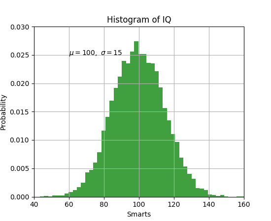
所有的text()命令都返回一个matplotlib.text.Text实例。与上面的行一样,您可以通过将关键字参数传递到文本函数或使用setp()来自定义属性:
t = plt.xlabel('my data', fontsize=14, color='red')详细参见:Text properties and layout
在文本中使用数学表达式
matplotlib接受任何文本表达式中的TeX方程表达式。语法参见:Mathjax与LaTex公式教程
plt.title(r'$\sigma_i=15$')标题字符串之前的r很重要 - 它表示字符串是一个原始字符串,而不是将反斜杠视为python转义。matplotlib有一个内置的TeX表达式解析器和布局引擎,并运送自己的数学字体 - 详细信息请参阅写数学表达式。因此,您可以跨平台使用数学文本,无需TeX安装。
注释文本
上述的基本text()命令的使用将文本放在Axes上的任意位置。文本的常见用途是注释绘图的某些特征,而annotate()方法提供了帮助器功能,使注释变得容易。在注释中,有两点需要考虑:由参数xy表示的注释位置和文本xytext的位置。这两个参数都是(x,y)元组。
import numpy as np
import matplotlib.pyplot as plt

ax = plt.subplot(111)

t = np.arange(0.0, 5.0, 0.01)
s = np.cos(2*np.pi*t)
line, = plt.plot(t, s, lw=2)

plt.annotate('local max', xy=(2, 1), xytext=(3, 1.5),
            arrowprops=dict(facecolor='black', shrink=0.05),
            )

plt.ylim(-2,2)
plt.show()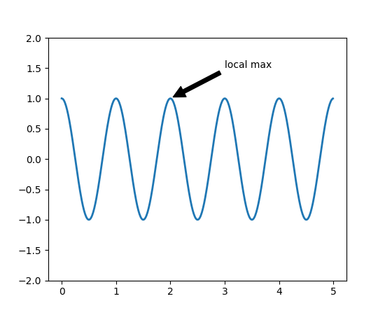 详细参见:基本注释和进阶注释
更多例子:annotation_demo.py
详细参见:基本注释和进阶注释
更多例子:annotation_demo.py
(5)对数等非线性轴
matplotlib.pyplot不仅支持线性轴刻度,还支持对数和对数刻度。如果数据跨越许多数量级,这是常用的。更改轴的刻度很容易:
plt.xscale('log')具有相同数据和y轴不同尺度的四个曲线的示例如下所示。
import numpy as np
import matplotlib.pyplot as plt

from matplotlib.ticker import NullFormatter  # useful for `logit` scale

# Fixing random state for reproducibility
np.random.seed(19680801)

# make up some data in the interval ]0, 1[
y = np.random.normal(loc=0.5, scale=0.4, size=1000)
y = y[(y > 0) & (y < 1)]
y.sort()
x = np.arange(len(y))

# plot with various axes scales
plt.figure(1)

# linear
plt.subplot(221)
plt.plot(x, y)
plt.yscale('linear')
plt.title('linear')
plt.grid(True)


# log
plt.subplot(222)
plt.plot(x, y)
plt.yscale('log')
plt.title('log')
plt.grid(True)


# symmetric log
plt.subplot(223)
plt.plot(x, y - y.mean())
plt.yscale('symlog', linthreshy=0.01)
plt.title('symlog')
plt.grid(True)

# logit
plt.subplot(224)
plt.plot(x, y)
plt.yscale('logit')
plt.title('logit')
plt.grid(True)
# Format the minor tick labels of the y-axis into empty strings with
# `NullFormatter`, to avoid cumbering the axis with too many labels.
plt.gca().yaxis.set_minor_formatter(NullFormatter())
# Adjust the subplot layout, because the logit one may take more space
# than usual, due to y-tick labels like "1 - 10^{-3}"
plt.subplots_adjust(top=0.92, bottom=0.08, left=0.10, right=0.95, hspace=0.25,
                    wspace=0.35)

plt.show()
更多参阅:Developer’s guide for creating scales and transformations